Widgets
Widgets let Peers and Flows show structured, interactive content instead of plain text only. A widget can display a chart, form, status summary, checklist, result card, or other guided view inside a conversation or shared workflow.
What this is
Widgets are reusable conversation elements managed by workspace admins. They help users review information, submit decisions, or interact with a result without leaving the Cognipeer experience.
Custom widget development belongs in the Developer Hub.
When to use widgets
Use widgets when a plain text answer is not enough:
- A Peer needs to show a structured business result.
- A Flow needs to collect or display information in a guided way.
- Users need to review options before choosing an action.
- A team wants consistent visual output across multiple Peers or Flows.
- Admins need to control which interactive experiences are available.
Use normal text responses when the result is short, does not require interaction, and does not need a reusable layout.
Before you start
Make sure:
- You have permission to manage workspace settings.
- The widget has a clear business purpose and owner.
- The Peer or Flow that will use the widget has been tested.
- Any required data source, tool, or integration is already connected.
- Your team knows who should maintain the widget over time.
Browse available widgets
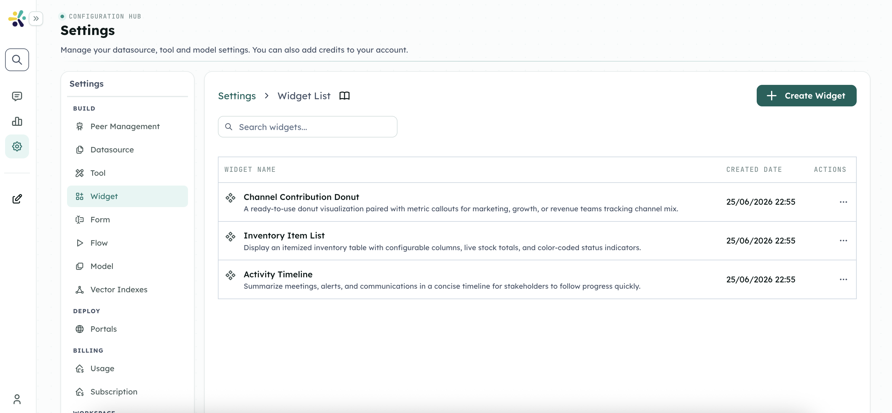
- Open Settings.
- Go to Widgets.
- Review the available widgets, descriptions, categories, and status.
- Use search or filters to find the widget your team needs.
- Open a widget to review where it is used and who can access it.
Add a widget to a Peer or Flow
- Confirm the widget is enabled in workspace settings.
- Open the Peer or Flow that should display it.
- Add the widget through the relevant Peer, Flow, or message step configuration.
- Map the values the widget needs from earlier conversation or Flow context.
- Save the configuration.
- Test from the same chat or Flow experience that users will use.
If a widget depends on values from a previous step, test cases where those values are present, missing, or incomplete.
Preview and test behavior
Before making a widget available to users, check:
- The widget appears in the expected place.
- Labels and values are understandable to the target audience.
- Empty states are clear.
- Permission-sensitive information is not shown to the wrong users.
- Mobile and desktop views are usable.
- The Peer or Flow still gives a useful response if the widget cannot load.
Manage widget access
Admins should limit widgets to the teams and use cases that need them.
Review access when:
- A new team starts using the widget.
- The widget displays sensitive business data.
- A Peer or Flow is shared more broadly.
- A widget is retired or replaced.
- Workspace roles or ownership changes.
Troubleshooting
The widget does not appear
Confirm the widget is enabled, the Peer or Flow is using the correct widget, and the active path reaches the step that displays it.
The widget appears with missing information
Check that the Peer or Flow provides the required values before the widget runs. Test with realistic inputs.
Users cannot see the widget
Review workspace permissions, Peer or Flow sharing settings, and widget access rules.
The widget is confusing for users
Simplify the labels, reduce optional fields, and make sure the surrounding Peer or Flow message explains what action the user should take.
For technical implementation
Use the Developer Hub for custom widget development, component code, data schemas, validation, embed behavior, SDK usage, and implementation troubleshooting.